Tableau(Dual axis combination charts in tableau)
Dual axis Combination Chart:
To create a Dual axis combination chart, follow the steps below:
Open Tableau Desktop and connect to the Sample - Superstore data source.
Navigate to a new worksheet.
From the Data pane, drag Order Date to the Columns shelf.
On the Columns shelf, right-click YEAR(Order Date) and select Month.

From the Data pane, drag Sales to the Rows shelf.
From the Data pane, drag Profit to the Rows shelf and place it to the right of SUM(Sales).
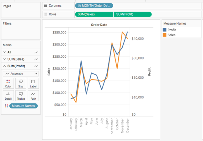
On the Rows shelf, right-click SUM(Profit) and select Dual-Axis.

The view updates. Measure Names is added to Color on the Marks card to differentiate the lines.

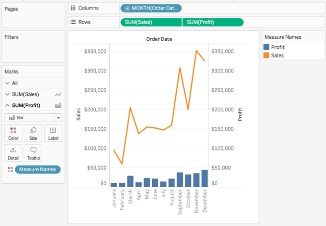
On the SUM(Profit) Marks card, click the Mark Type drop-down and select Bar.

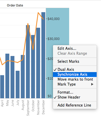
In the visualization, right-click the Profit axis and select Synchronize Axis.

Output:

Comments
Post a Comment