Tableau(Line Graphs)
What is Tableau Line Chart?
The Tableau Line Chart is a visualization option where the two axes of a graph represent the dimension ( like time) and a measure ( like say sales of a company) are plotted together. This generates points known as Markers. By joining all the points together a line is formed which represents a trend or any useful insight.
Types of Tableau Line Charts:
Simple Line Chart
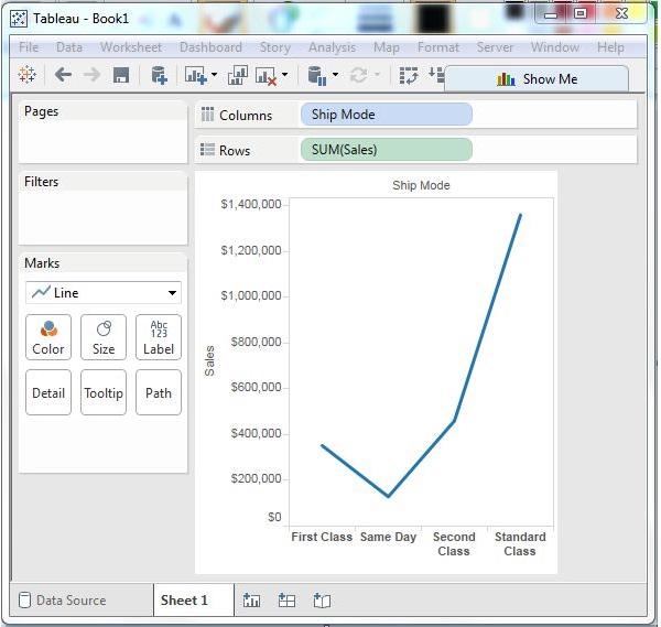
Choose one dimension and one measure to create a simple line chart. Drag the dimension Ship Mode to Columns Shelf and Sales to the Rows shelf. Choose the Line chart from the Marks card. You will get the following line chart, which shows the variation of Sales for different Ship modes.

Multiple Measure Line Chart
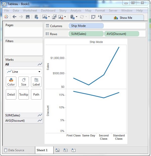
You can use one dimension with two or more measures in a line chart. This will produce multiple line charts, each in one pane. Each pane represents the variation of the dimension with one of the measures.

Line Chart with Label
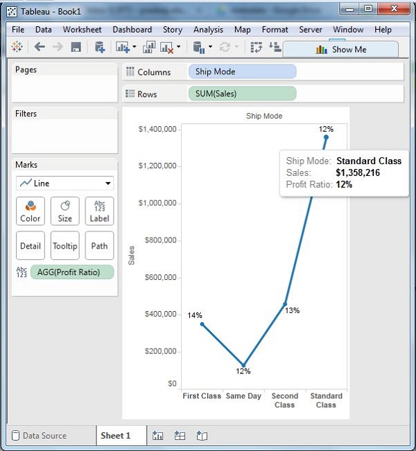
Each of the points making the line chart can be labeled to make the values of the measure visible. In this case, drop another measure Profit Ratio into the labels pane in the Marks card. Choose average as the aggregation and you will get the following chart showing the labels.

Tableau Line Chart Advantages
The advantages of Tableau Line Charts:
- It is the best method to represent changes that are spread over different time periods.
- It helps in understanding and predicting trends over historical data.
- Line charts are simple, easy to make and understand, at the same time very informative.
- Line charts can be optimized in such a way that they can represent even minor changes that is not possible in other charts.
- It also allows for easier comparison between different parameters since multiple lines can be plotted on the same axes.
Tableau Line Chart Disadvantages
Disadvantages of Line Chart in Tableau:
- Plotting multiple lines over the same axes makes it cluttered.
- If the data has many parameters, it becomes quite complex.
- It is only ideal for data with numerical values.
- Deciding consistent scales for axes is difficult and even a small error in them will lead to a distorted graph.
- If the numerical values are fractions and decimals the line chart is not very efficient.
How to build a Tableau line chart?
The following steps can be used to create a Tableau line chart. The Electronics Store sales dataset that is present in Tableau Desktop is used throughout the example, but you can use the dataset of your choice.
Step 1: Add the Measure and Dimension Field
- For this example, we will create a simple line chart where the dimension is Order Date and Measure is the Sales field. Drag and drop the Columns and Rows and a preliminary chart is created.
Step 2: Add a new Profit Measure
- Let’s create a multi-line graph from the simple graph created in the previous step.
- We need to add another measure. Add profits to the rows section.
- A new line chart is created instantly just below the first one.
Step 3: Drag SUM Measure
- We can merge two different columns to perform an action the same. We can drag SUM(profit) to the y-axis of the chart.
Step 4: Details of Measure Fields
- We will have a common y-axis for both the sales and profit values.
- We use the Measure value in the rows section to be able to remove separate values.
- To find details of Measure Value we can click on the Measure Value card-present beneath the marks card.
- To make the two lines different colored put the measured value into the color card.
Step 5: Manage the Appearance
- Now that we have both measures sharing a common y-axis, we can change the dimension.
- Here we are changing the order data from year to month, but it can change to weeks and days as well.
- The image shows we have data points for each month.
- Moving the cursor on data points shows the details of points such as a month, year, profit/sales in detail
- The color scheme can also be changed.
- Other properties like line opacity, chart borders, line markers, and many more can be changed.
- Also labels can be added by dragging the label card present on the marks card.


Comments
Post a Comment