tableau(Pace chart in tableau)
pace charts in Tableau:

How to create a pace chart with a linear pace in Tableau
To normalize the bars in a pace chart, create a calculated field which calculates the progress to goal. This is used to represent the bars instead of the current values. The formula for this calculation is [Current Value] / [Goal].
After you have created the Progress to Goal calculated field, create a horizontal bar chart showing the progress to goal for each KPI:
With a pace chart, the goal line is always normalized across every KPI at 100%. To add this reference to the visualization, simply add a reference line with a constant of 1 (which equals 100%):
For this illustration, we will pretend that the pace to goal should be the same across all seven of our KPIs. When using a linear pace, a calculated field can be created to calculate how far to goal each KPI should be at the current point in the year. For example, if we are in week 42, the pace calculation would be:
(1/52) * 42
This calculation is dividing the year into 52 equal parts (i.e. weeks), then multiplying that fraction by the number of weeks that have passed in the year.
In Tableau, you have the option to replace the 42 with a parameter that allows the end user to change the multiplier.
Once you have the Pace calculated field, add it to the Detail Marks card so it can be used as a reference line. Then add a reference line that shows where the pace should be at this point in the year:
Lastly, to color the bars to illustrate whether each KPI is on pace, slightly behind pace, or behind pace, create a calculated field with the scoring logic. This will vary based on your own requirements, but as one example, I’ll pretend that 100% or above is on pace, 90–99.99% is slightly behind pace, and anything less than 90% is behind pace:
This pace score is then dragged to the Color Marks card to color each bar by its progress to goal classification:
In this tutorial, we used a linear pace that was calculated by taking 1/52 of the year multiplied by the current week of the year. However, this pace can be replaced with a different metric such as the value for each KPI at this point last year, or a goal for each respective KPI at this point in the year.
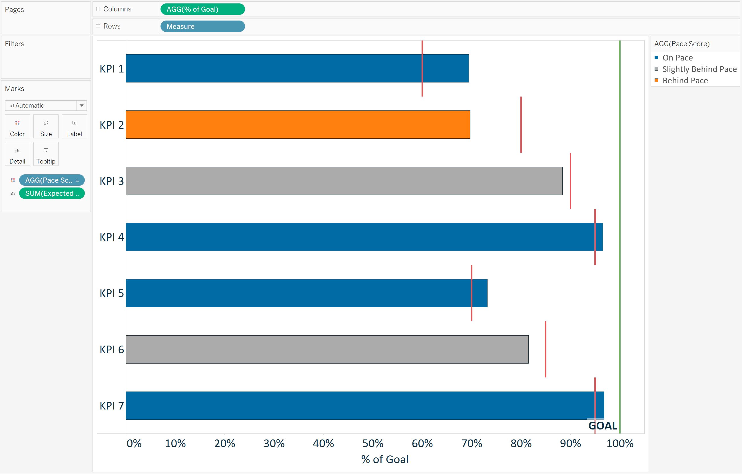
Here is one more example using a different expected pace for each respective KPI. In this example, I have the expected pace at this point in the year as an additional field in my underlying data:
The seasonal pace chart using this data looks like this in Tableau:
To create this version, I replaced the calculated linear pace reference line with a reference line for expected pace, which shows the expected pace for each respective KPI. I also replaced the linear pace calculation in the Pace Score calculated field with the Expected Pace measure from the underlying data:
Notice how this seasonal pace chart tells a different story regarding the progress to goal for each KPI than the pace chart with the linear pace. But in both cases, pace charts were used to normalize progress to goal calculations across KPIs to get a more effective visualization about the business.
Comments
Post a Comment