Tableau(Dual axis map in tableau)
Dual-Axis (Layered) Maps in Tableau:
👉 A dual-axis map is a map with two sets of geographic data overlaid on top of one another.
👉 For example, a filled map of U.S. states with data points for each city layered on top.
👉 There are three ways to create a dual-axis map in Tableau:
- By using Tableau Latitude(generated) and Longitude(generated) fields
- By using custom latitude and longitude fields
- By using a combination of Tableau Latitude(generated) and Longitude (generated) fields, and custom latitude and longitude fields
Follow the steps below to learn how to create a dual-axis map using each of these methods.
Open Tableau Desktop.
In the Connect pane, under Saved Data Sources, connect to the Sample-Superstore data source.
In the Data pane, under Dimensions, double-click State.
A map view is created.
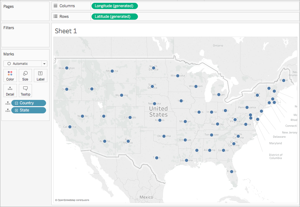
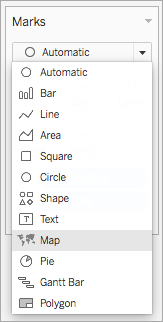
On the Marks card, click the Mark Type drop-down and select Map.
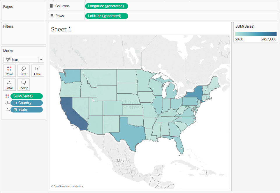
From the Data pane, under Measures, drag Sales to Color on the Marks card.
The map updates to show the sum of sales by state. The states with higher sales are darker blue, and the states with fewer sales are lighter blue.
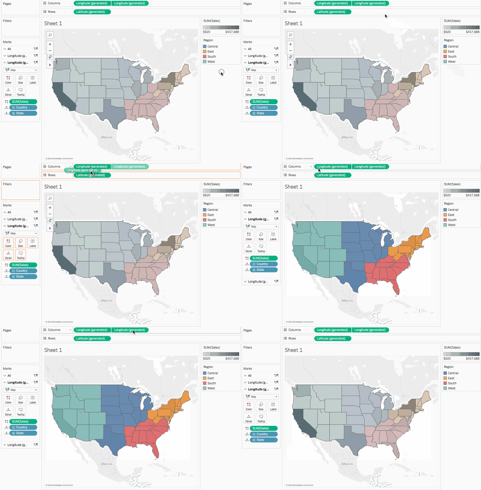
On the Columns shelf, control-drag (command-drag on a Mac) the Longitude (generated) field to copy it, and place it to the right of the first Longitude field.

On the Marks card, select the top Longitude (generated) tab.
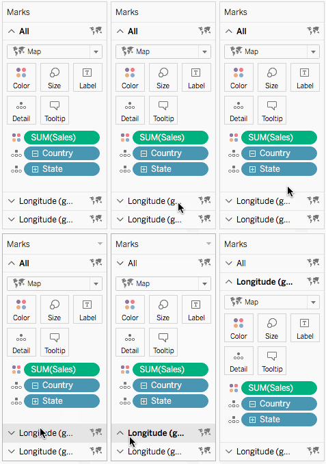
From the Data pane, under Dimensions, drag Region to Color on the Marks card.
The map view on the left updates.
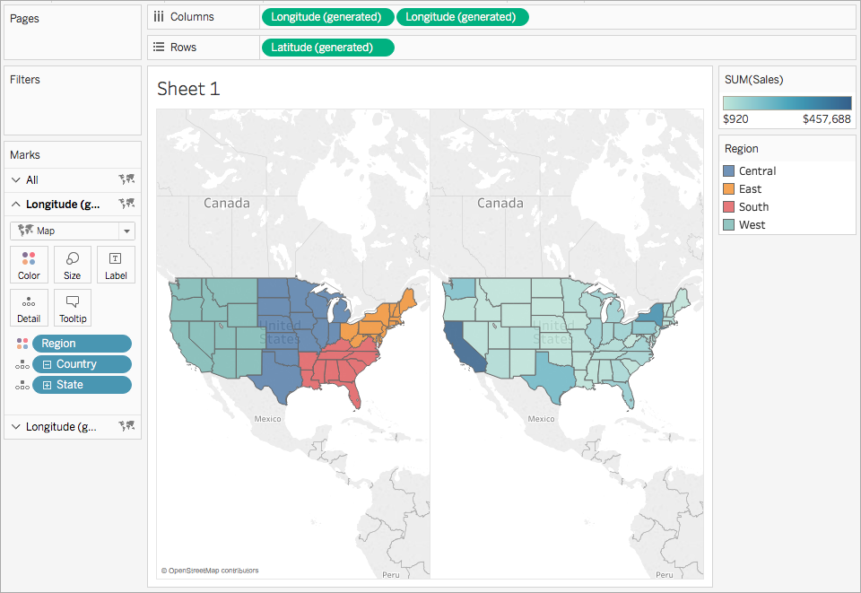
On the Columns shelf, right-click the Longitude (generated) field on the right and select Dual Axis.
The map views are now overlapping each other. You might not be able to see the map on the bottom layer.
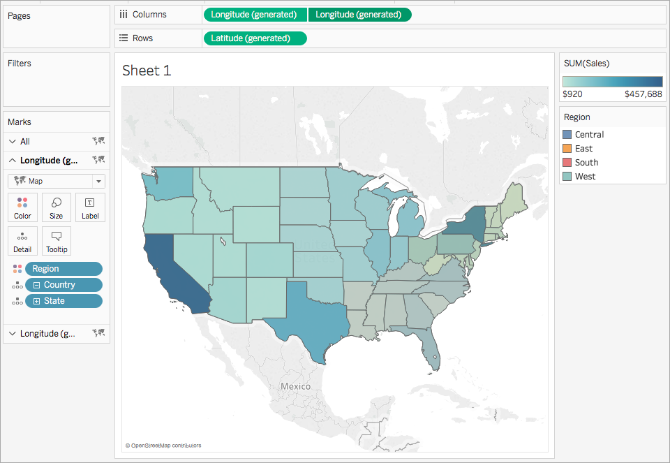
On the Marks card, ensure that the bottom Longitude (generated) tab is selected, and then click Color > Edit Colors.
In the Edit Colors dialog box that opens, click the Palette drop-down, select Gray, and then click OK.
Notice that the colors of the map update.
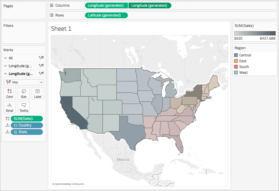
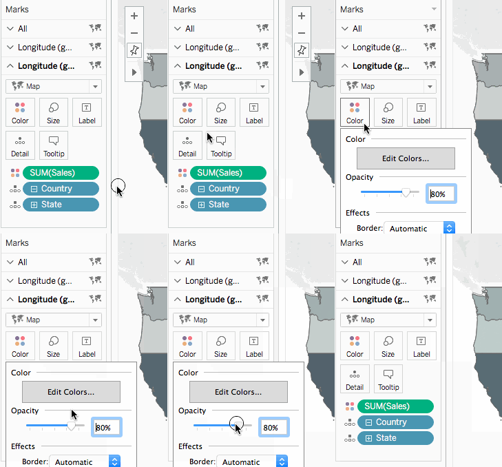
On the Marks card, click Color again.
In the Color pop-up dialog box, under Opacity, move the slider to approximately 75%.
The dual axis (layered) map is now complete. For each region, you can now see which states has the most sales.
Tip: To change which map is on top, rearrange the Longitude (generated) fields on the Columns shelf.
If your data source contains custom latitude and longitude fields, you can use them instead of the Tableau Latitude (generated) and Longitude (generated) fields to create a dual-axis map. Follow the steps below to learn how.
Open Tableau and connect to a data source with custom latitude and longitude values.
Navigate to a new worksheet.
In the Data pane, right-click the custom latitude field and select Geographic Role > Latitude.
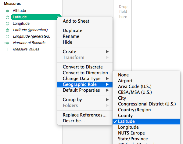
Note that the Latitude geographic role may already be assigned to the field.
In the Data pane, right-click the custom longitude field and select Geographic Role > Longitude.
Note that the Longitude geographic role may already be assigned to the field.
From the Data pane, drag the custom latitude field to the Rows shelf.
From the Data pane, drag the custom longitude field to the Columns shelf.
From the Data pane, under Dimensions, drag a geographic field to Detail on the Marks card.
In this example, the geographic field, Country (Name), is used.
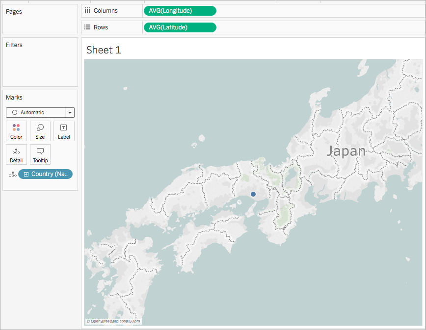
On the Marks card, click the Mark Type drop-down and select Map.

The map updates to a filled map.
On the Rows shelf, Ctrl-click (Command-click on a Mac) and drag the custom latitude field to the right. This copies the field.
A second, identical map is created and the Marks card updates to include three tabs. The middle tab is for the top map, and the bottom tab is for the bottom map.
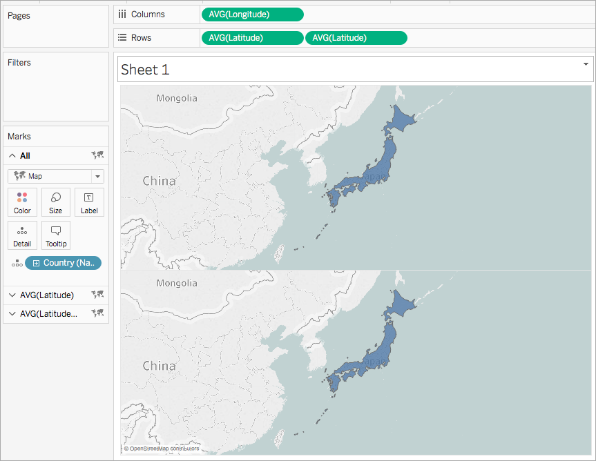
On the Marks card, click the bottom tab and remove the geographic field by dragging it off.
From the Data pane, drag a new geographic field to Detail on the Marks card.
In this example, Airport (City) is used.
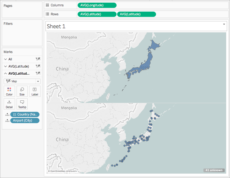
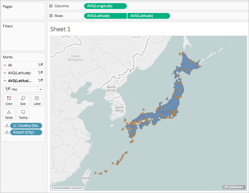
On the Marks card, click Color and select a color for the marks. In this example, the color orange is used.
On the Rows shelf, right-click the custom latitude field on the right and select Dual Axis.
The two maps are now combined.
Follow the steps in each scenario to learn how to create a dual-axis map from generated and custom latitude and longitude fields.
Best practices for creating dual-axis maps with two sets of latitude and longitude fields:
The Latitude(generated) and Longitude(generated) fields must be placed on the Columns and Rows shelves.
The custom latitude and longitude fields must be placed on Detail on the Marks card, and then converted to dimensions. For more information, see steps 11 and 12 in Scenario 1.
The custom latitude and longitude fields must be assigned the Latitude and Longitude geographic roles. For more information, see Assign Geographic Roles .
When joining data sources, use a Full Outer join. For more information, see Join Your Data.
Scenario 1: Use generated and custom latitude and longitude fields from a single data source
Open Tableau Desktop and connect to a data source.
In this example, an excel spreadsheet that contains country and city names, as well as custom latitude and longitude columns for airport locations around the world, is used.
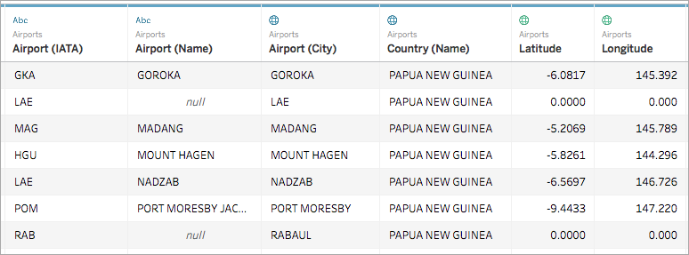
Navigate to a new worksheet.
Notice that, in the Data pane, under Measures, there are two sets of latitude and longitude fields: the custom latitude and longitude fields from the data source, and the generated latitude and longitude fields that Tableau creates from your geographic fields.
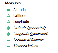
From the Data pane, under Measures, drag Longitude(generated) to the Columns shelf.
From the Data pane, under Measures, drag Latitude(generated) to the Rows shelf.
From the Data pane, under Dimensions, drag a geographic location to Detail on the Marks card.
In this example, Country (Name) is used. A map view with a data point for every country in the data source is created.
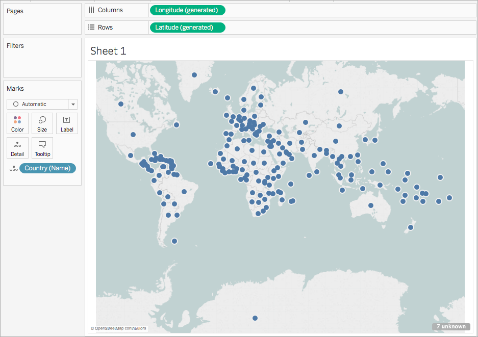
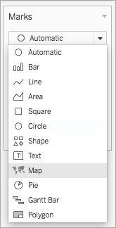
On the Marks card, click the Mark type drop-down and select Map.
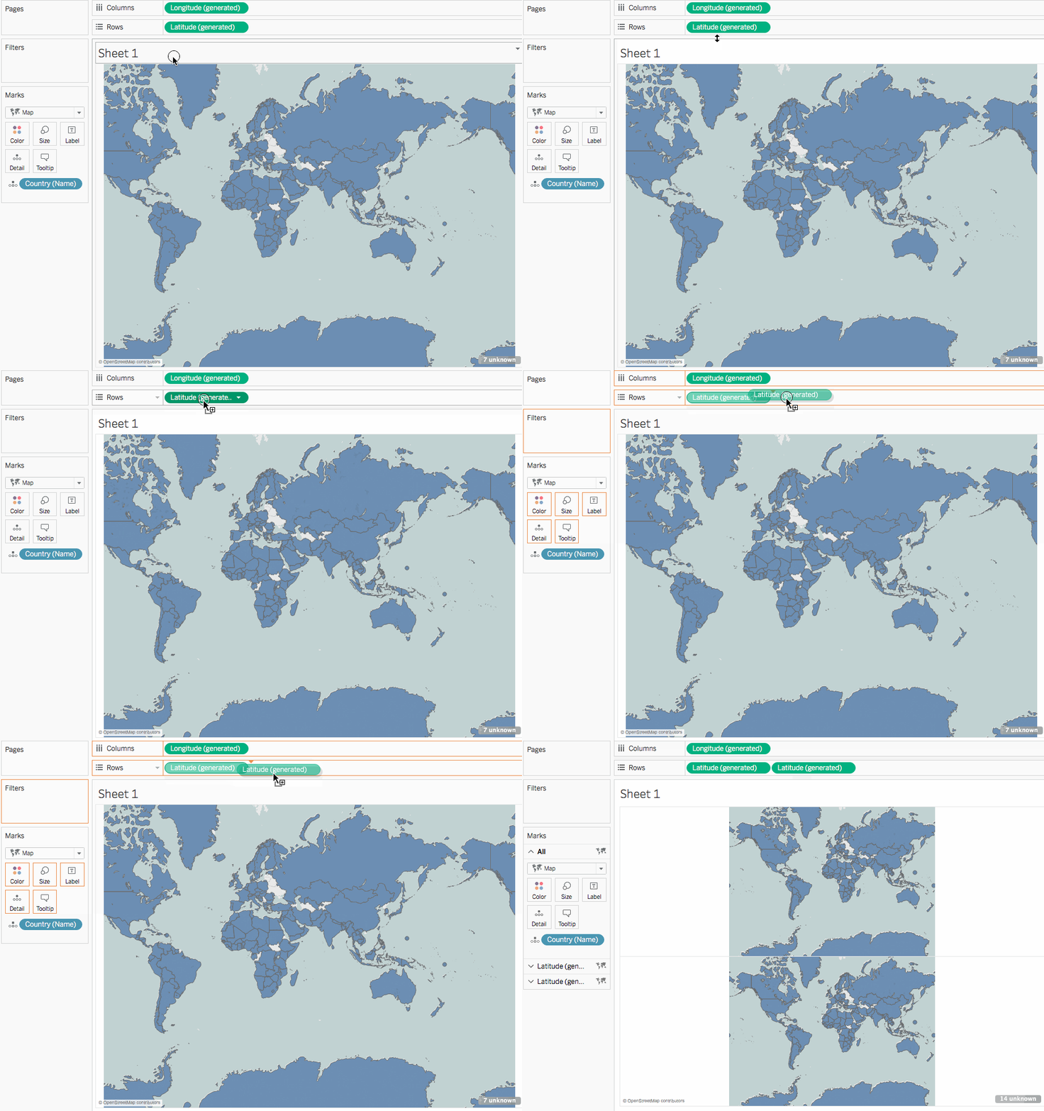
On the Rows shelf, Ctrl-click (Command-click on Mac) and drag the Latitude(generated) field to the right. This copies the field.
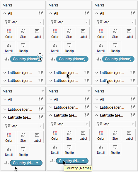
A second, identical map is created and the Marks card updates to include two tabs labeled Latitude(generated). The top tab is for the top map, and the bottom tab is for the bottom map.
On the Marks card, click the bottom Latitude(generated) tab and remove Country(name).
From the Data pane, under Measures, drag the custom Latitude field to Detail on the Marks card.
From the Data pane, under Measures, drag the custom Longitude field to Detail on the Marks card.
On the Marks card, right-click the custom Latitude field and select Dimension.
Repeat step 11 for the custom Longitude field.
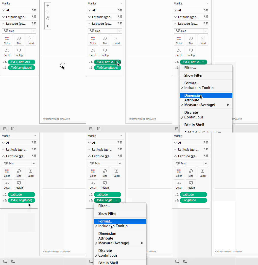
On the Marks card, click Color, and then select a new color.
In this example, the color orange is used.
On the Rows shelf, right-click the Latitude(generated) field on the right and select Dual Axis.
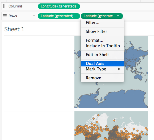
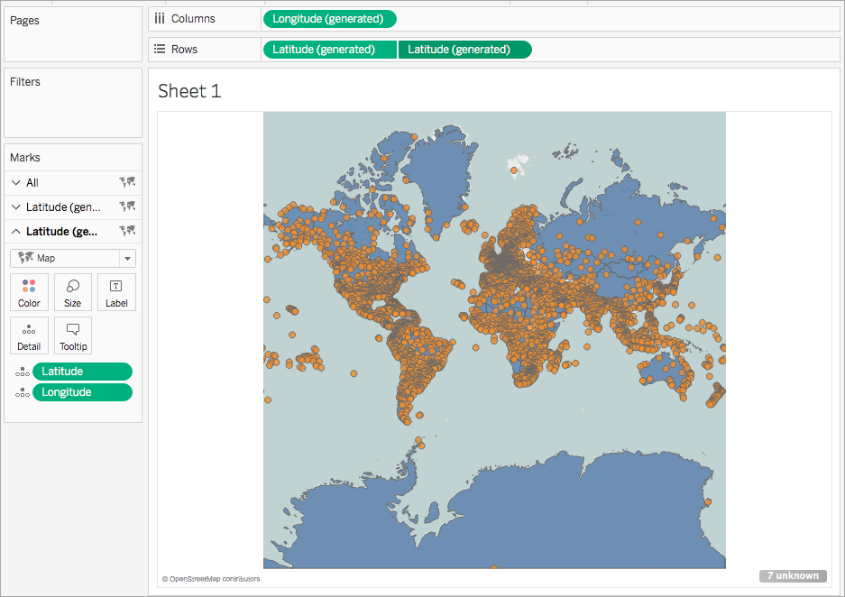
The two maps are now combined. You can filter the view as needed or zoom in to a particular area.
Comments
Post a Comment