Tableau (gnatt chart in tableau)
Gantt Chart:
👉 Use Gantt charts to show the duration of events or activities.
👉 In a Gantt chart, each separate mark (usually a bar) shows a duration. For example, you might use a Gantt chart to display average delivery time for a range of products.
👉 To create a Gantt chart that shows how many days elapse on average between order date and ship date, follow these steps:
Connect to the Sample - Superstore data source.
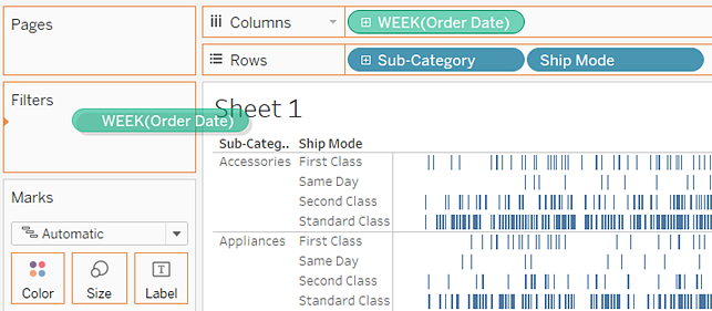
Drag the Order Date dimension to Columns.
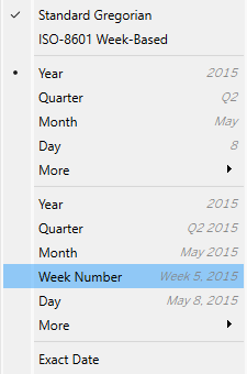
On the Columns shelf, click the Year (Order Date) drop-down arrow, and then select Week Number.
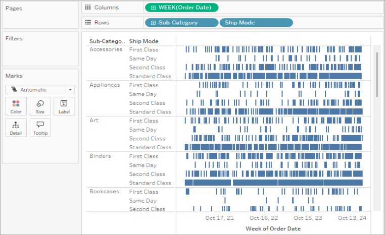
The column headers change. Individual weeks are indicated by tick marks because there are 208 weeks in a four-year span—too many to show as labels in the view.

Drag the Sub-Category and Ship Mode dimensions to the Rows shelf. Drop Ship Mode to the right of Sub-Category.
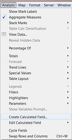
In the toolbar menu, click Analysis > Create Calculated Field. You can also right-click (Control-click on Mac) any field in the Data pane and select Create > Calculated Field.
In the calculation dialog box, name your calculated field OrderUntilShip.
Clear any content that's in the Formula box by default.
In the Formula box, enter the following formula and then click OK:
DATEDIFF('day',[Order Date],[Ship Date])The formula creates a custom measure that captures the difference between the Order Date and Ship Date values, in days.
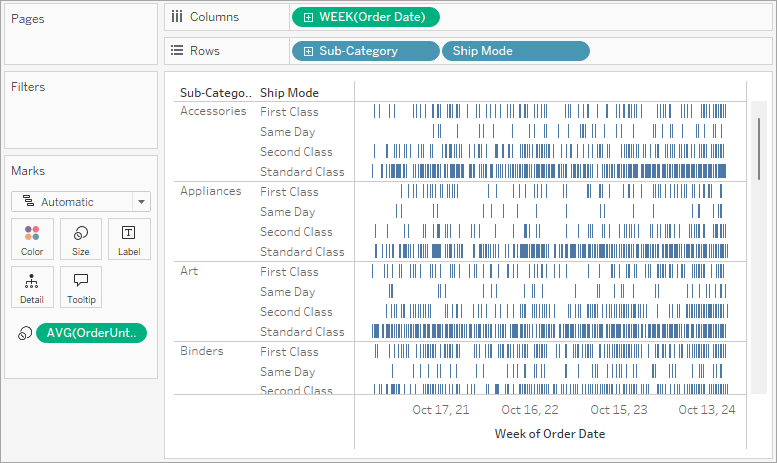
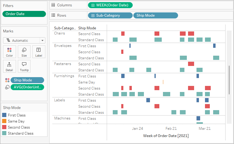
Drag the OrderUntilShip measure to Size on the Marks card.
Right-click (Control-click on Mac) the SUM(OrderUntilShip) field on the Marks card, and then select Measure (Sum) > Average.

We can make our data more readable by filtering down to a smaller time window.
Hold down the Ctrl key (Option key on the Mac) and drag the Week(Order Date) field from the Columns shelf to the Filter shelf.
In the Filter Field dialog box, select Range of Dates and then click Next.

Set the range to a three-month time interval, such as 1/1/2013 to 3/31/2013, and then click OK.
Drag the Ship Mode dimension to Color on the Marks card.


Comments
Post a Comment