Tableau(Scatter plot in tableau)
Scatter Plot:
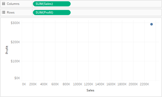
In Tableau, you create a scatter plot by placing at least one measure on the Columns shelf and at least one measure on the Rows shelf. If these shelves contain both dimensions and measures, Tableau places the measures as the innermost fields, which means that measures are always to the right of any dimensions that you have also placed on these shelves. The word "innermost" in this case refers to the table structure.
| Creates Simple Scatter Plot | Creates Matrix of Scatter Plots |
 |  |
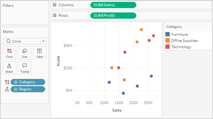
To use scatter plots and trend lines to compare sales to profit, follow these steps:
- Open the Sample - Superstore data source.
Drag the Profit measure to Columns.
Tableau aggregates the measure as a sum and creates a horizontal axis.
Drag the Sales measure to Rows.
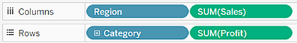
Drag the Category dimension to Color on the Marks card.
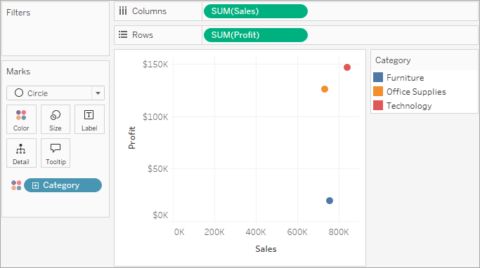
Drag the Region dimension to Detail on the Marks card.
To add trend lines, from the Analytics pane, drag the Trend Line model to the view, and then drop it on the model type.
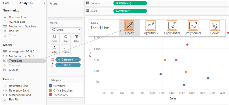
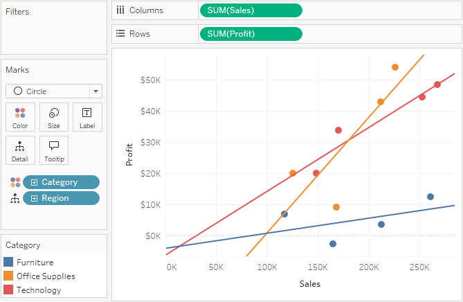
Tableau adds three linear trend lines—one for each color that you are using to distinguish the three categories.
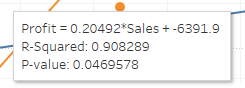
Hover the cursor over the trend lines to see statistical information about the model that was used to create the line:


Comments
Post a Comment